Creating a reusable action menu component in SwiftUI
SwiftUI has revolutionised how developers build user interfaces for Apple platforms - its fluent API make creating UIs more approachable and efficient. However, you can often end up with code that is repetitive, tightly coupled to the app’s data model, and generally not well structured.
In this post, I will walk you through the process of building a reusable SwiftUI component that you can seamlessly integrate in your own SwiftUI apps.
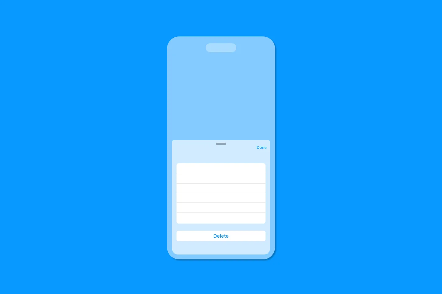
For an app I am currently working on , I needed an action menu similar to the one in Apple’s Mail app. Building a view like this is relatively straightforward in SwiftUI - it mostly consists of a couple of Buttons that are embedded in a List view that is presented on a sheet.
Here is a simplified version of the code:
import SwiftUI

struct ContentView: View {
  @State private var fruits = ["Apple", "Banana", "Orange", "Mango", "Pear", "Grape", "Pineapple", "Strawberry"]
  @State private var isMoreActionTapped = false
  @State private var selectedFruit: String? = nil

  var body: some View {
    NavigationStack {
      List(fruits, id: \.self) { fruit in
        Text(fruit)
          .swipeActions(edge: .trailing, allowsFullSwipe: true) {
            Button("Delete", systemImage: "trash", role: .destructive) {
              // action
            }
            Button("More", systemImage: "ellipsis.circle") {
              selectedFruit = fruit
              isMoreActionTapped.toggle()
            }
            .tint(.gray)
          }
      }
      .navigationTitle("Fruits")
      .sheet(isPresented: $isMoreActionTapped) {
        NavigationStack {
          List {
            Section("Text Options") {
              Button("Uppercase", systemImage: "characters.uppercase") {
                // action
              }

              Button("Lowercase", systemImage: "characters.lowercase") {
                // action
              }
            }

            Section {
              Button("Delete Item", systemImage: "trash", role: .destructive) {
                // action
              }
            }
          }
          .navigationTitle("Actions")
          .navigationBarTitleDisplayMode(.inline)
          .toolbar {
            ToolbarItem(placement: .topBarTrailing) {
              Button("Done") {
                isMoreActionTapped = false
              }
            }
          }
        }
        .presentationDetents([.medium, .large])
      }
    }
  }
}

#Preview {
  ContentView()
}
This works just fine, but there are a couple of issues:
- All of the code lives in the main view and takes up a lot of space. Just imagine how many lines of code this will occupy if we add more actions!
- The code for the action menu is tightly coupled to the main view - what if we want to implement a similar action menu on a different view? We’d have to copy and paste a lot of the code. If we make changes to the code in one place, we’d have to manually update it in all other places - a maintenance nightmare.
- The styling doesn’t match the look and feel of the action menu in Apple’s Mail.app (with the label on the left, and the icon on the right).
In short - this is not reusable!
In the following, I will show you how to turn this prototype into a reusable SwiftUI component that you can easily import and use in your own applications. Along the way, you will learn how to apply the techniques I teach in my video series Building Reusable SwiftUI Components. By the end of this post, you should have enough knowledge to start building and shipping your own reusable SwiftUI components.
Let’s get started!
Creating a custom view for the action menu
The first step required to turn the initial, non-reusable code snippet into a reusable component is to extract the code for displaying the menu items into a separate view.
The easiest way to achieve this is to create a new file using the SwiftUI view template, naming it ActionMenu, and then cut / paste the NavigationStack and all its containing code into the body of this new view:
import SwiftUI

struct ActionMenu: View {
  let title: String = "Actions"
  @Binding var selectedFruit: String?
  @Binding var fruits: [String]
  @Environment(\.dismiss) private var dismiss

  var body: some View {
    NavigationStack {
      List {
        Section("Text Options") {
          Button("Uppercase", systemImage: "characters.uppercase") {
            // action
            dismiss()
          }

          Button("Lowercase", systemImage: "characters.lowercase") {
            // action
            dismiss()
          }
        }

        Section {
          Button("Delete Item", systemImage: "trash", role: .destructive) {
            // action
            dismiss()
          }
        }
      }
      .navigationTitle(title)
      .navigationBarTitleDisplayMode(.inline)
      .toolbar {
        ToolbarItem(placement: .topBarTrailing) {
          Button("Done") {
            dismiss()
          }
        }
      }
    }
  }
}

#Preview {
  @Previewable @State var fruits = ["Apple", "Banana", "Orange", "Mango", "Pear", "Grape", "Pineapple", "Strawberry"]
  @Previewable @State var isMoreActionTapped = false
  @Previewable @State var selectedFruit: String? = nil

  ActionMenu(
    selectedFruit: $selectedFruit,
    fruits: $fruits
  )
}
Notice that this requires us to pass the array of fruits and the selected fruit item (i.e., the one the action menu will act on) to ActionMenu.
The call site looks a lot (c)leaner now which a good step in the right direction. However, ActionMenu is tightly coupled to the app’s data model now, preventing us from reusing it in other contexts.
Refactoring ActionMenu for reuse
To make ActionMenu reusable, we will first introduce a view builder. View builders are one of the key features that power SwiftUI’s declarative syntax, and they are used extensively in SwiftUI’s core components like VStack, HStack, List, and others.
import SwiftUI

struct ActionMenu<Content: View>: View {
  @Environment(\.dismiss) private var dismiss

  let title: String
  let content: () -> Content

  init(
    title: String = "Actions",
    @ViewBuilder content: @escaping () -> Content
  ) {
    self.title = title
    self.content = content
  }

  var body: some View {
    NavigationStack {
      List {
        content()
      }
      .navigationTitle(title)
      .navigationBarTitleDisplayMode(.inline)
      .toolbar {
        ToolbarItem(placement: .topBarTrailing) {
          Button("Done") {
            dismiss()
          }
        }
      }
    }
  }
}
By using a view builder, we can extract all the code we used for creating the contents of the action menu, and pass it in from the call site.
#Preview {
  @Previewable @State var fruits = ["Apple", "Banana", "Orange", "Mango", "Pear", "Grape", "Pineapple", "Strawberry"]
  @Previewable @State var isMoreActionTapped = false
  @Previewable @State var selectedFruit: String? = nil

  ActionMenu {
    Section("Text Options") {
      Button("Uppercase", systemImage: "characters.uppercase") {
        // action
        // dismiss() // Cannot find 'dismiss' in scope
      }

      Button("Lowercase", systemImage: "characters.lowercase") {
        // action
        // dismiss() // Cannot find 'dismiss' in scope
      }
    }

    Section {
      Button("Delete Item", systemImage: "trash", role: .destructive) {
        // action
        // dismiss() // Cannot find 'dismiss' in scope
      }
    }
  }
}
This also means we can remove all references to any application specific types, such as the fruits and selectedFruit properties from the ActionMenu type, since we will be dealing with them at the call site.
This is great, as it makes ActionMenu more reusable in other contexts.
However, notice that we’re no longer able to call dismiss() to dismiss the sheet. This is something we’ll have to fix in a later step.
You might be thinking “no problem, we can just bring back the isMoreActionTapped state property we used in the beginning. That would definitely work, but there’s a better way to implement the sheet dismissal. But before we get there, let’s first improve the developer experience of setting up the action menu.
Creating a view modifier
At the moment, creating the action menu requires us to set up a sheet, and then instantiate the ActionMenu, making the call site more busy than it should be. Wouldn’t it be nice to able to just write the following:
List { ... }
  .actionMenu(title: "Actions", isPresented: $isMoreActionTapped) {
    // actions
  }
To make this possible, we will introduce a custom view modifier. In SwiftUI, we use view modifiers like .font, .padding, .foregroundColor and others all the time to specify the look and feel of our SwiftUI views.
But you can also create custom view modifiers to encapsulate (or group) other view modifiers that you routinely use together. Creating the sheet with the enclosed action menu is such a case.
View modifiers typically consist of two parts: firstly, a struct that conforms to the ViewModifier protocol and contains the code you want to make reusable. Secondly, a convenience function that is defined as an extension on View, allowing us to use view modifiers in a fluent way by chaining them together.
Let’s first define ActionMenuModifier, and encapsulate the sheet / action menu structure.
struct ActionMenuModifier<MenuContent: View>: ViewModifier {
  let title: String
  @Binding var isPresented: Bool
  let menuContent: () -> MenuContent

  init(title: String, isPresented: Binding<Bool>, @ViewBuilder  menuContent: @escaping () -> MenuContent) {
    self.title = title
    self._isPresented = isPresented
    self.menuContent = menuContent
  }

  func body(content: Content) -> some View {
    content
      .sheet(isPresented: $isPresented) {
        ActionMenu(title: title) {
          menuContent()
        }
        .presentationDetents([.medium, .large])
      }
  }
}
A couple of notes:
contentis the view that you apply the view modifier tomenuContentrepresents the sections and buttons making up the action menu. Notice how we’re passingmenuContentthrough to theActionMenuview we defined earlier.- Also notice that we’re using a view builder for the menu content, to match the view builder on the
ActionMenuview.
To apply a view modifier to a view, you can use the modifier view modifier (yes, very meta, I know):
List { ... }
  .modifier(
    ActionMenuModifier(
      title: "Actions",
      isPresented: $isMoreActionTapped,
      menuContent: {
        // actions
      }
    )
  )
I think you will agree with me that approach feels clunky and doesn’t quite achieve the elegant syntax we expect from SwiftUI’s view modifiers.
We can fix this by introducing an extension on View:
extension View {
  public func actionMenu(title: String, isPresented: Binding<Bool>, @ViewBuilder content: @escaping () -> some View) -> some View {
    modifier(
      ActionMenuModifier(
        title: title,
        isPresented: isPresented,
        menuContent: content
      )
    )
  }
}
This extension allows us to apply the view modifier to any view in a fluent way by calling actionMenu:
    List { }
      .actionMenu(title: "Actions", isPresented: $isMoreActionTapped) {
        // actions
      }
This approach aligns much better with SwiftUI’s API, offering a similar experience to built-in modifiers like confirmationDialog, and ultimately provides a smoother developer experience.
Styling the action labels
In the introduction, I mentioned that I wanted to re-create the look and feel of the action menu in Apple’s mail app. If you compare the action menus in Apple’s mail app and the sample app in this blog post, you will notice one main differences: the icons in Apple’s mail app are on the right.
Now, we could re-create this design by creating a custom label like this:
Button {
  // action handler
} label: {
  HStack(spacing: 22) {
    Text("Uppercase")
    Spacer()
    Image(systemName: "characters.uppercase")
      .foregroundStyle(Color.accentColor)
      .font(.system(size: 22, weight: .light))
  }
}
However, this would lead to a lot of code duplication.
Instead, let’s implement a custom style that we can use inside the ActionMenu view.
Label, like many other SwiftUI views supports view styling. This means you can customize the entire look and feel of the view by providing a custom style. To customize Label, we need to implement a custom style that conforms to LabelStyle.
The main requirement of LabelStyle is a makeBody function, and by looking at the following code snippet, you will realise that this function is very similar to the body function of a regular SwiftUI view - the only difference is that is has a configuration parameter:
struct MenuLabelStyle: LabelStyle {
  @ScaledMetric(relativeTo: .body) private var iconSize: CGFloat = 22.0

  func makeBody(configuration: Configuration) -> some View {
    // view layout
  }
}
Configuration is a type that is specific to the view style, and contains the key components of the respective view. For example, here is the definition of LabelStyleConfiguration:
/// The properties of a label.
@available(iOS 14.0, macOS 11.0, tvOS 14.0, watchOS 7.0, *)
public struct LabelStyleConfiguration {

    /// A type-erased title view of a label.
    @MainActor @preconcurrency public struct Title {

        /// The type of view representing the body of this view.
        ///
        /// When you create a custom view, Swift infers this type from your
        /// implementation of the required ``View/body-swift.property`` property.
        @available(iOS 14.0, tvOS 14.0, watchOS 7.0, macOS 11.0, *)
        public typealias Body = Never
    }

    /// A type-erased icon view of a label.
    @MainActor @preconcurrency public struct Icon {

        /// The type of view representing the body of this view.
        ///
        /// When you create a custom view, Swift infers this type from your
        /// implementation of the required ``View/body-swift.property`` property.
        @available(iOS 14.0, tvOS 14.0, watchOS 7.0, macOS 11.0, *)
        public typealias Body = Never
    }

    /// A description of the labeled item.
    public var title: LabelStyleConfiguration.Title { get }

    /// A symbolic representation of the labeled item.
    public var icon: LabelStyleConfiguration.Icon { get }
}
As you can see, this gives us access to the title and the icon being used to display the label, allowing us to implement MenuLabelStyle as follows:
struct MenuLabelStyle: LabelStyle {
  @ScaledMetric(relativeTo: .body) private var iconSize: CGFloat = 22.0

  func makeBody(configuration: Configuration) -> some View {
    HStack(spacing: 22) {
      configuration.title
      Spacer()
      configuration.icon
        .foregroundStyle(Color.accentColor)
        .font(.system(size: iconSize, weight: .light))
    }
  }
}
You might notice we’re using the same layout we prototyped earlier when we considered styling the label of the Buttons manually. Also notice how we’re using configuration.title and configuration.icon to get access to those key elements of the Label view.
To make sure the icon scales proportionally to the title of the view when the user uses dynamic type, we define a scaled metric constant for the icon size.
Finally, to make it more convenient to use this new style, let’s define a constant for this style:
extension LabelStyle where Self == MenuLabelStyle {
  static var menu: MenuLabelStyle { .init() }
}
This allows us to instantiate MenuLabelStyle as follows:
Label("Hello world", systemImage: "globe")
  .labelStyle(.menu)
The cool thing about SwiftUI styles is that they’re stored in the SwiftUI environment, and thus will be inherited to all views in the view hierarchy. This means we can apply this new view style to the List view inside our ActionMenu view, and it will be applied to all labels inside the list view:
struct ActionMenu<Content: View>: View {
  @Environment(\.dismiss) private var dismiss

  let title: String
  let content: () -> Content

  init(
    title: String = "Actions",
    @ViewBuilder content: @escaping () -> Content
  ) {
    self.title = title
    self.content = content
  }

  var body: some View {
    NavigationStack {
      List {
        content()
      }
      .labelStyle(.menu)
      .navigationTitle(title)
      .navigationBarTitleDisplayMode(.inline)
      .toolbar {
        ToolbarItem(placement: .topBarTrailing) {
          Button("Done") {
            dismiss()
          }
        }
      }
    }
  }
}
Dismissing the sheet
We’re almost there! There’s just one missing piece: automatically dismissing the sheet after an action is tapped.
To solve this, we can leverage the power of custom button styles in SwiftUI. Remember, custom styles don’t just control the look of a view, but also its behavior!
There are several styles for buttons: DefaultButtonStyle, BorderlessButtonStyle, PlainButtonStyle, BorderedButtonStyle, BorderedButtonStyle, and PrimitiveButtonStyle, but only two button style configurations: PrimitiveButtonStyleConfiguration and ButtonStyleConfiguration.
PrimitiveButtonStyleConfiguration provides access to the button’s role, label, and - most importantly - its trigger, which is what we need to override the button’s action behaviour.
Here is an implementation of ActionMenuButtonStyle that allows us to dismiss the sheet after the button trigger has been initiated:
struct ActionMenuButtonStyle: PrimitiveButtonStyle {
  @Environment(\.dismiss) private var dismiss

  func makeBody(configuration: Configuration) -> some View {
    configuration.label
      .contentShape(Rectangle()) // make entire view tappable
      .onTapGesture {
        configuration.trigger()
        dismiss()
      }
  }
}
A couple of notes:
- We use
configuration.trigger()to call the buttons action handler. - After that, we
dismissthe sheet. - To make sure the button’s action is triggered even if the user taps inside the white space between the label and the icon, we set the content shape of the button’s label to
Rectangle.
Just like we did for the custom label style, let’s declare a function to make applying this new style more fluent:
extension PrimitiveButtonStyle where Self == ActionMenuButtonStyle {
  static var action: ActionMenuButtonStyle {
    ActionMenuButtonStyle()
  }
}
Finally, we need to apply this new view modifier to the action menu:
struct ActionMenu<Content: View>: View {
  @Environment(\.dismiss) private var dismiss

  let title: String
  let content: () -> Content

  init(
    title: String = "Actions",
    @ViewBuilder content: @escaping () -> Content
  ) {
    self.title = title
    self.content = content
  }

  var body: some View {
    NavigationStack {
      List {
        content()
      }
      .labelStyle(.menu)
      .buttonStyle(.action)
      .navigationTitle(title)
      .navigationBarTitleDisplayMode(.inline)
      .toolbar {
        ToolbarItem(placement: .topBarTrailing) {
          Button("Done") {
            dismiss()
          }
        }
      }
    }
  }
}
That’s it! Now our sheet will automatically close after an action is tapped.
That’s a wrap!
We did it! We built a reusable action menu that looks and behaves just like the one in Apple Mail. 🎉
Along the way, we explored some key SwiftUI techniques that you can apply to your own projects. Here’s a quick recap of what we covered:
- Prototyping and Reusability: We saw how to efficiently prototype views and make them reusable throughout your app.
- Custom View Modifiers: We learned how to create custom view modifiers that seamlessly integrate new views into the view hierarchy.
- View Builders: We discovered how view builders can decouple your views from business logic, making them more flexible and reusable.
- SwiftUI Styles: We explored how to encapsulate custom styling for your views using SwiftUI’s style system.
- Behavioral Customization with Styles: We even saw how custom styles can be used to modify the behavior of views, like automatically dismissing our action sheet.
Hopefully, you found this tutorial helpful and can use these techniques to build even more awesome SwiftUI interfaces!
Where to go from here
Want to dive deeper into the world of reusable SwiftUI components? I’ve got you covered!
- Video Series: Check out my YouTube series, Building SwiftUI Components, for a comprehensive look at the fundamentals. It covers a lot of the basics we didn’t have time for in this post.
- Conference Talks: I’ve also given talks on this topic at various conferences.
- Swift Heroes: Learn how to build a text input field with a floating label.
- SwiftConf: See how to create a reusable avatar component.
- Interactive tutorial: For an interactive, hands-on tutorial, check out the Tutorials page on my blog, which includes a tutorial that walks you through the process of building a reusable avatar component in SwiftUI.
Bonus
As a bonus, I’ve made the action menu component available as a ready-to-use component: you can grab the code for this action menu component on GitHub and use it in your own projects! Just install it as an SPM package from this URL: https://github.com/peterfriese/ActionMenu
Agentic Coding in Xcode with Gemini CLI
Build apps with AI assistance in Xcode using Gemini CLI
Turn Your Photos Into Miniature Magic with Nano Banana
Build stunning image generation apps in iOS with just a few lines of Swift

Reverse-Engineering Xcode's Coding Intelligence prompt
A look under the hood
Extracting structured data from PDFs using Gemini 2.0 and Genkit
Understanding SwiftUI Preferences
SwiftUI Parent / Child View Communication